On the Same Page | Howl’s Moving Castle | Diana Wynne Jones

on the same pageHowl’s Moving Castle • Diana Wynne Jones

This book has been on my TBR for AGES. The copy I own I actually bought for my young cousin but never gave it to her. Instead of returning it, I kept it for myself and then it languished, unread, for a few years. Fast forward to our annual December powwow to pick our On the Same Page books for this year, and Alyssa was like, “I want to read HOWL’S MOVING CASTLE,” and I was like, “OMG ME TOO.” So glad that we all agreed to give this classic middle grade fantasy a go, because it was incredibly charming and fun, and I laughed so many times.

One of the things I noticed while I was looking at this book on Goodreads was the different covers. There’s so many! And they’re so awesome! And they highlight different aspects of the story, or have different interpretations of the same thing! YAY! So for this month’s On the Same Page feature, I’m going to share some different book cover editions and talk about why I looooove them all (well, most of them).
[Read more…]

Top Ten Tuesday (121) | Book Cover Trends

Top Ten TuesdayTop Ten Book Cover Trends

I originally thought this topic would be difficult. I was wrong. There were a few recent trends in book cover design that I’d known I wanted to highlight here, but other than that, I was kind of at a loss. Until I went and looked through my TBR and that most excellent Listopia feature on Goodreads. THEN I discovered things that I forgot I’d noticed, or things that I didn’t realize happened more than once. Below are ten trends that I like, but there are more that I just didn’t have the time to include. There are several books that apply to more than one trend, as you might notice, and SO MANY BOOKS that I didn’t have room to include! To the pictures!

Top Ten TuesdayMirror Images

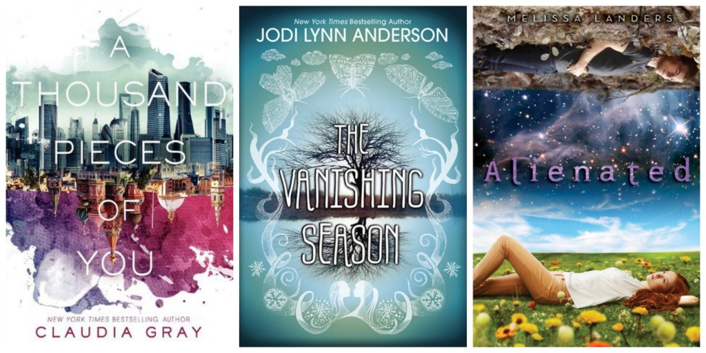
I noticed this trend when I first saw the cover for A THOUSAND PIECES OF YOU, but then I remember that something similar was going on with THE VANISHING SEASON. ALIENATED is kind of the same deal–an image that is inverted from top to bottom, or different on the top and bottom. I like this. It’s visually interesting and a fun metaphor for whatever might be going on INSIDE.

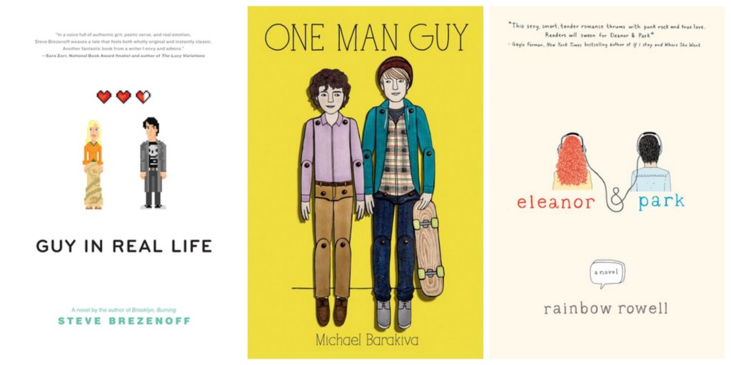
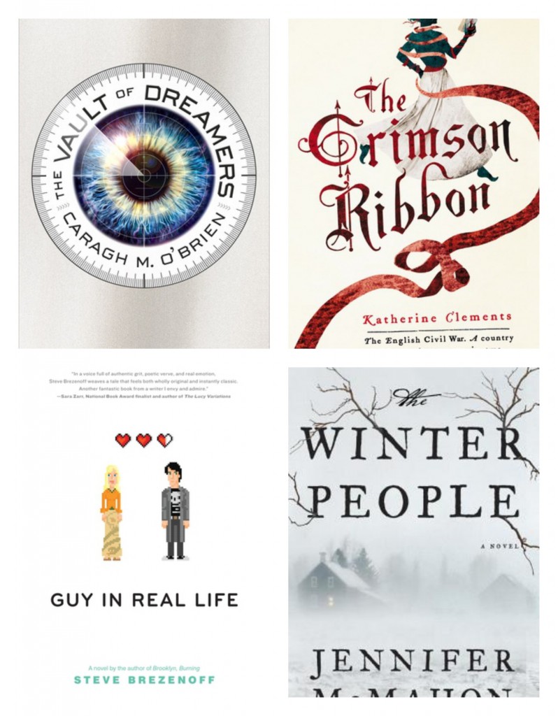
Top Ten TuesdayIllustrated People

This one starts with ELEANOR & PARK, but it’s continuing on with GUY IN REAL LIFE and ONE MAN GUY. I will always, ALWAYS see the appeal of an illustrated cover. It’s one of my favorite trends of anything. I’d always be drawn to an illustrated cover over one with photos and models on it.

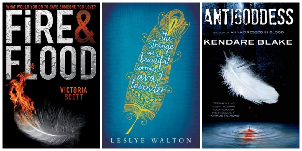
Top Ten TuesdayFeathers

This one popped out at me while I was scrolling through my TBR. I’m particularly fond of the illustrated feather on the cover for Ava Lavender, and it irks me a touch that the covers for FIRE & FLOOD and ANTIGODDESS are nearly identical. But I do love feathers. And I love how the feathers are all symbolic of the contents: Ava’s feather is whimsical and odd (for a feather), FIRE & FLOOD’s feather is a flame, and ANTIGODDESS’ feather is bleeding.
Top Ten Tuesday

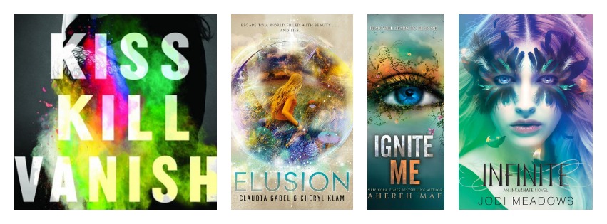
Rainbowish/Ombre Things

I don’t know how else to describe this style element. It’s rainbowish, it’s colorful, it’s shiny, it’s ombre. So, all of those things. I’ve read none of these books, alas, so I don’t know how apropos they are of the stories, but they sure are pretty.

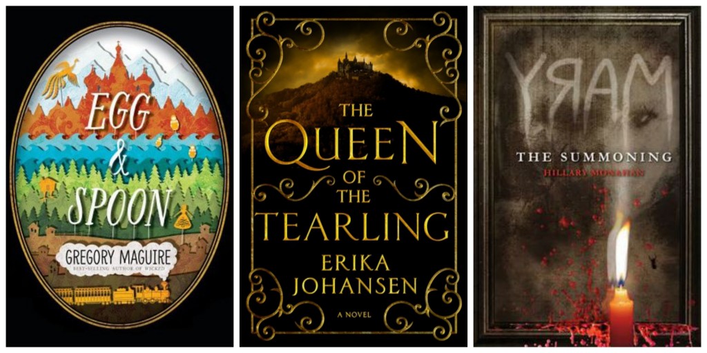
Top Ten TuesdayFrames

This one didn’t strike me until I went looking for similarities, and it struck me that there were a number of books recently released or still to come that had some kind of frame, whether it’s the deliberate shape of EGG & SPOON, the more ornate design of THE QUEEN OF THE TEARLING, or the dark edge of THE SUMMONING. Lots of other examples of this as well, and I like it. Makes the covers seem more like pieces of art.

Top Ten Tuesday

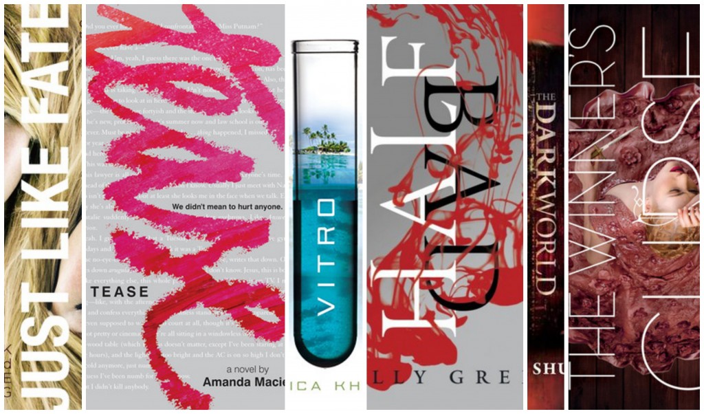
Vertical Titles

THIS ONE is a trend I LOVE. I LOVE when the titles are oriented differently. It’s LOTS of fun. I had to leave off a bunch of examples of this because I literally couldn’t fit any more images in my collage. But FUN. Top Ten Tuesday

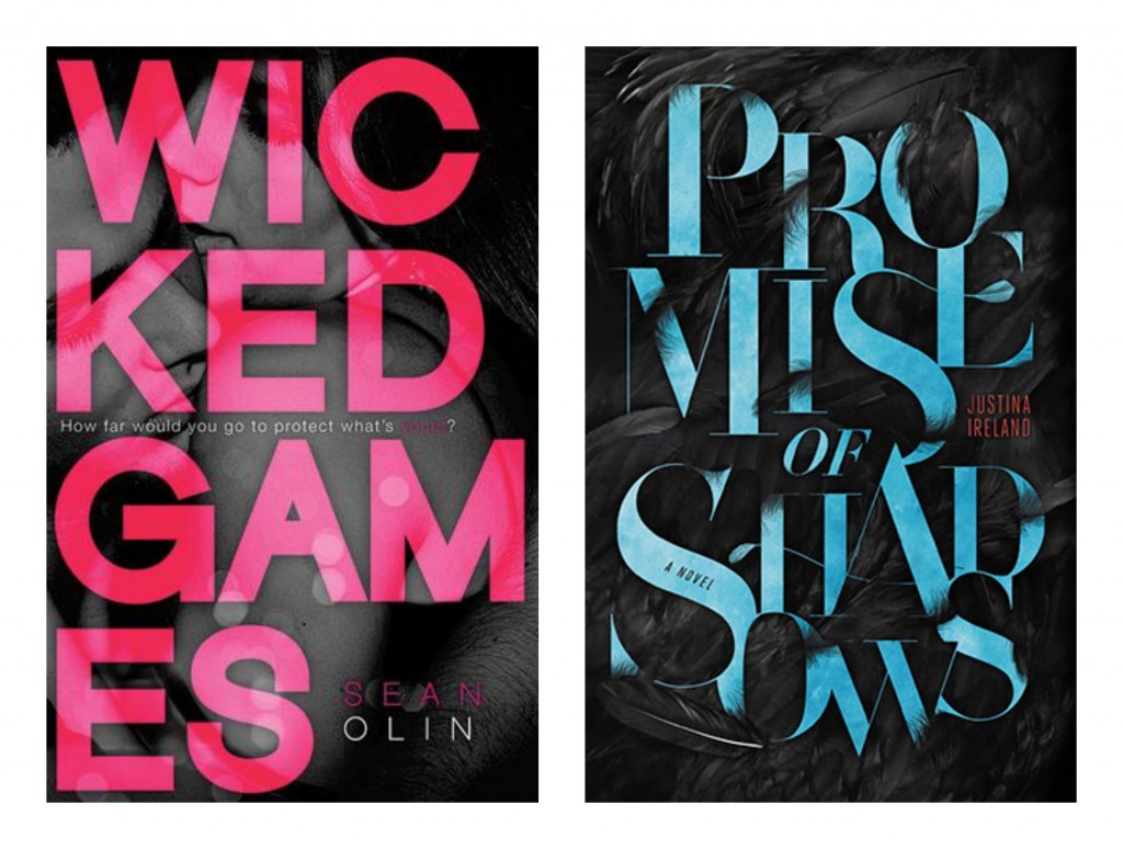
Broken Titles

This is an interesting one, friends. Not sure if I LOVE love it, but I do like the way it looks. It’s a little weird to see what is normally a typesetting error done deliberately, and it is kind of jarring to read, but it does catch my eye. That’s likely helped along by the dark background and the vibrant text color, but still. (Also, MORE FEATHERS!)

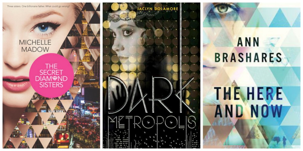
Top Ten TuesdayShape Overlays

Shapes! This is an interesting way to turn what might otherwise be unspectacular covers into more visually catchy ones. And I like the way they are used differently on each: one to break up an image and a face, another to indicate some kind of barrier (the curtainy thing on DARK METROPOLIS), and another to change the vibe of the whole cover.

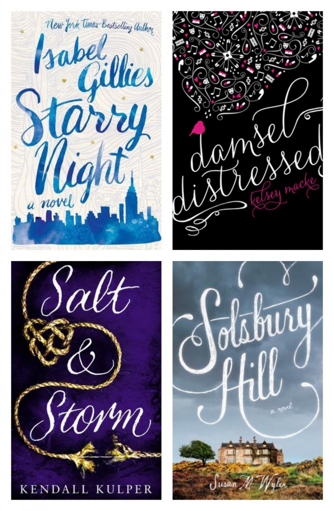
Top Ten TuesdayCalligraphy

CALLIGRAPHYYY!! I love calligraphy. I love it. I wish I could do it. I would read ANY book that had calligraphy–especially when it looks so handwritten and not like a clean font–on the cover. SALT & STORM is probably my favorite of the group, but I really do love them all. So, so gorgeous. MORE OF THIS, PLEASE!

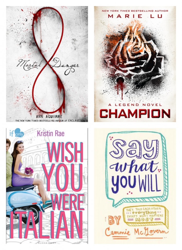
Top Ten Tuesday Top Ten TuesdayWhite Covers

Guys, I LOVE this trend. I love it to bits and tiny pieces. White covers–or whitish covers–always grab my attention because they stand out so well, especially on a shelf. There’s not much that pops quite as much to my eye than white or very light colors. There are so many other covers that follow this trend that I didn’t include here, but it’s officially A Thing, and probably my favorite trend around right now.