
Top Ten Covers I Would Like To Redesign
Covers are tricky business, friends. They’re obviously so important to the way people are attracted to books–or not. But it’s also a case of not being able to please everyone all the time. That being said, there are some covers that I see and I’m like, “for REAL?” So without further ado, here’s my list of ten covers I would love to redesign, for one reason or another.
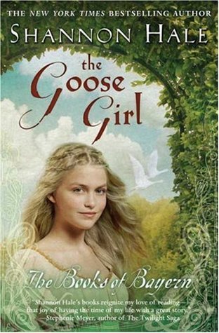 The Goose Girl: Books of Bayern #1 by Shannon Hale (paperback)
OMGGGGGG. This cover is kind of angry-making. It’s one of my biggest cover pet peeves. The original cover is SOOO PRETTY and perfect and then the paperback looks like this. This is less a cover I want to redesign than a cover that I wish hadn’t been changed in the first place. It makes the book look…cheesy or something. WAHH!
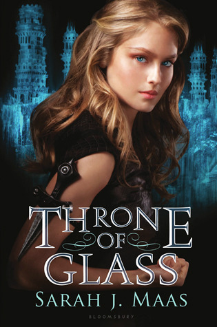 Throne of Glass: Throne of Glass #1 by Sarah J. Maas (hardcover)
Friends, this cover isn’t so terrible, but when you compare it to the UK version it’s definitely less cool. I have an issue, generally, with fantasies or historical novels that have photographs on the cover. There’s something disingenuous about it. Like, are there cameras in this world or this time? It gives the wrong impression of the setting and vibe to me. So glad that CROWN OF MIDNIGHT was redesigned to look like the UK version. BIG improvement.
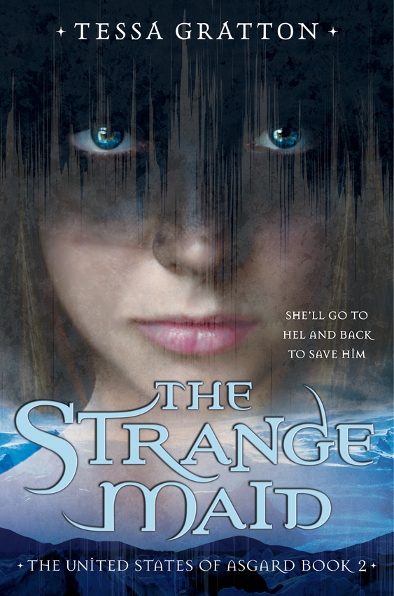 The Strange Maid: United States of Asgard #2 by Tessa Gratton
This one is just creepy. Like, the EYES. I guess since the book has the word “strange” in the title, the cover make sense because the girl DOES look super weird and unsettling. But DANG. I can’t look at it for too long before I’m like *shudders*.
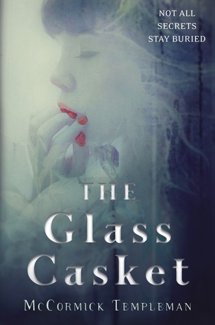 The Glass Casket by McCormick Templeman
There’s lots to like about this cover, if I’m being honest (which, ALWAYS), but WHY IS SHE SUCKING ON HER FINGERS? I don’t understand.
 The Elemental series by Brigid Kemmerer
So this is one of my FAVORITE series, friends. TRUTH. But the covers–AHHH! The posing! The broody-face! Not that these guys are unpleasant to look at because NO. But there are so many amazing opportunities to make these covers STUNNING–the characters can control the elements, for crying out loud!–that these seem like a bummer.
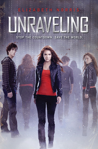 Unraveling: Unraveling #1 by Elizabeth Norris
The bonus about this cover, and the cover for book 2, is that it actually makes sense. But sometimes having actual photos on the cover of books just gives me the mehs. I sometimes dislike having the characters faces forced on me. It makes me think like I can’t develop my own vision of them in my head, which I always wind up doing anyway because that’s what I do when I read, and then the two images fight against each other and WAH!
 Vampire Academy: Vampire Academy #1 by Richelle Mead
First of all, LOVE these books. But this girl looks too much like Angelina Jolie for me to be able to get over it.
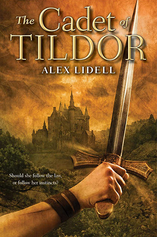 The Cadet of Tildor by Alex Lidell
There is something about this cover that bugs me, friends. There’s something cheesy-looking about it. It happens sometimes with fantasies. Thankfully, the inside is still awesome.
 Such a Rush by Jennifer Echols
OMG SOMEONE GET THIS GIRL A HAIR TIE. I can barely overcome the urge I have every time I see this cover to brush all of her hair DOWN.
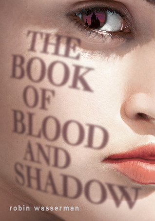 The Book of Blood and Shadow by Robin Wasserman
There is something really unsettling about this cover. I mean, there’s that huge, weird eyeball and the lips look super fleshy and bizarre. But what has always bugged me the most about this cover is that I can’t think of anything in this book–granted my memory of it is not great–that would warrant the cover being entirely covered by a pasty face. ICK.


Great piece! For what it’s worth, I think ‘Such a Rush’ and ‘The Book of Blood and Shadow’ are both saved by their beautiful fonts and title design. Seriously, wow.
(I’m probably be one of the few nerdy people that care very, very deeply for title design!)
And I know exactly what you mean by the use of photographs being off-putting! Oftentimes, I feel like the model has not even been styled to look like the character, and it’s more that the character might look a bit like the model. It feels very inauthentic. Publishers can’t just chuck a Getty model on the cover and fool us into thinking it’s relevant.
OMG, she does look like Angelina Jolie!!! Haha. I always thought she reminded me of one of my friends but now that you mention it…..
The original ToG cover…. Doesn’t that girl look almost identical to Sarah J. Maas!? Like, did someone paint her on the cover!?
I don’t even want to talk about The Glass Casket.
Oh my gosh I love the Such a Rush Cover! I think it’s such an interesting way to portray flight and movement in a still picture.
I am with you on all the others though. And I’ve always thought the Vampire Academy girl looked a lot like Angelina Jolie, glad I’m not alone!